5 Contact Us Page Mistakes Costing You Daily Leads
After fixing just the Contact Us page layout, one client went from almost no form submissions to steady inbound inquiries every week using the same traffic.
Want More Clients Fast?
Steal This Website Rescue Kit to Get More Clients, More Calls, and More Sales on Autopilot
If you want more calls, emails, and bookings, contact page optimization for small business should be at the top of your to-do list. A great “Contact Us” page is not just a form. It is a conversion moment where trust, clarity, and convenience come together.
Why contact page optimization for small business matters
For many visitors, the contact page is where they decide if you are legitimate and if reaching out will be easy. Small tweaks here can boost leads without redesigning your entire site. Shorter paths, clear instructions, and credible signals reduce friction and increase action.
The fundamentals: what every high-performing contact page includes
Use this checklist to cover the basics before you get fancy.
Clear, specific headline that matches intent, like “Request a Free Estimate” or “Schedule a Consultation Today.”
One primary call to action with a labeled button such as Get a Quote, Book a Call, or Check Availability.
Short form that asks only for what you need to respond within one business day.
Multiple contact options for different preferences: phone, email, form, and chat.
Trust signals like reviews, certifications, service areas, and response-time promises.
Mobile-first layout with large tap targets and auto-fill compatible fields.
Map and hours if local visits matter.
Next-step clarity that sets expectations about response time and process.
Design that converts: keep it focused and friendly
Busy contact pages distract people. The goal is to guide them to one action, fast.
Limit navigation to keep visitors on the page. Consider a simplified header.
Use a single column form to avoid eye zig-zag. It is easier to scan and complete.
Place social proof nearby. Two or three short testimonials with names and cities is plenty.
Make the button obvious. Use a high-contrast color and a verb, like Send My Request.
For deeper design tips, see Best Website Design Tips for Small Business Owners and Simple Design Tweaks That Boost Small Business Credibility.
Forms that get finished: smart fields and microcopy
Shorter forms convert better because they reduce mental load. Ask only what is essential for a useful reply.
Start with these fields:
Name
Email or phone (pick one required)
How can we help? (short text area or a simple dropdown)
Optional fields can appear conditionally after a user selects a service. That way, a roofing lead sees different optional questions than a bakery order.
Microcopy that removes doubt:
Privacy note under the button: “We never share your information.”
Response time near the headline: “We respond within one business day.”
What happens next below the form: “A team member will text to confirm a time.”
For more on turning clicks into clients, read How to Make Your Website Convert Visitors into Clients.

Mobile first: most people will contact you on a phone
Your contact page should feel effortless on a small screen.
Auto-capitalize names and show numeric keyboards for phone fields.
Avoid tiny links. Make phone numbers tap-to-call and addresses tap-to-map.
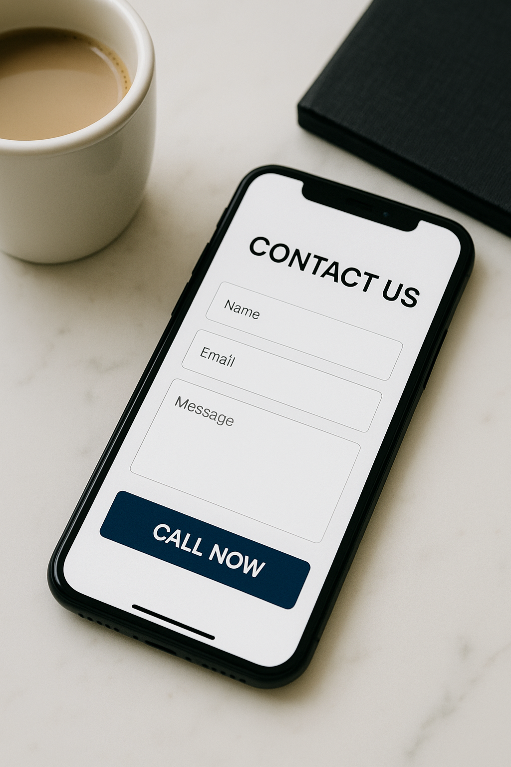
Keep the button sticky. A bottom-fixed Call Now or Book Online button boosts action on long pages.
Improve handheld usability with the tips in Mobile Optimization Tips for Local Business Websites.
Speed and trust: two silent conversion boosters
Even a beautiful page fails if it loads slowly or feels risky.
Page speed affects drop-off. Compress images, lazy-load maps, and avoid heavy scripts on the contact page.
Trust signals build confidence. Include review stars, a brief service area map, and a small list of payment methods you accept.
Consistent NAP (name, address, phone) across your site, Google Business Profile, and directories reduces confusion and helps local SEO.
If your site looks fine but leads are low, check out Why Your Website Isn’t Bringing in Leads.
Copy that nudges action: be specific and human
Generic copy leads to generic results. Speak to the exact outcome people want.
Replace “Submit” with “Get My Free Estimate.”
Replace “Contact Us” with “Schedule a 15-Minute Call.”
Add a one-sentence value promise under the headline: “No pushy sales. Just clear next steps and pricing.”
If you are unsure where to start, use the structure in How to Create a Professional Website for Your Small Business.
Real-world examples: what works across industries
Realtor example:
A local agent’s contact page highlights “Book a 15-Minute Strategy Call” with a three-field form. Right beside it, two client quotes mention quick replies and clear next steps. A short paragraph explains, “After you submit, you will get a calendar link to pick your time.” Results improve because visitors know what happens next.
Plumber example:
Instead of a long form, the headline says “Text or Tap to Book a Same-Day Visit.” The page shows two big buttons: Call Now and Text Us, plus a three-field emergency form. A small banner promises “We reply within 15 minutes during business hours.” Conversions rise because urgent users do not want to type.
Bakery example:
For custom cakes, the form asks for event date, guest count, and budget range as optional fields that appear only after selecting “Custom Order.” Next to the form, a mini gallery shows three customer photos with one-line captions. People feel inspired and complete the request.
For layout guidance, see Best Homepage Layout for Small Businesses.
Reduce friction with smart tech
Auto-reply email that confirms the request and restates next steps.
Calendar booking for discovery calls so visitors pick times without waiting.
Click-to-call tracking to understand which devices and pages drive calls.
Spam protection with invisible checks that do not frustrate real users.
To line up your contact page with the rest of your site’s conversion flow, read Website Conversion Tips for Small Business.
Placement and internal linking that support discovery
Not everyone lands on your contact page first. Help them find it in one click.
Put Contact in the top navigation and the footer.
Add a mini contact panel on key service pages.
Use contextual links in blog posts that invite action, such as Get a Free Estimate.
Tie this into your broader site plan with Small Business Website Design Tips.
Quick testing plan: improve results in one week
Run simple A/B tests or time-boxed changes.
Shorten the form to three required fields.
Change the button label to a benefit-driven phrase.
Add two testimonials near the form.
Make phone and address tap-to-call and tap-to-map.
Set a response-time promise and honor it.
Track submissions, calls, and booked consults for seven days. Keep the winners, then iterate again.
Conclusion and next step
Contact page optimization for small business is one of the fastest ways to lift leads without rebuilding your entire site. Focus on clarity, trust, and convenience. If you want a contact page that truly converts, book a free consultation with Digital Dream Homes and we will map out the exact improvements to implement this month.
Matt Pieczarka
Other Posts About Small Business Websites You Might Like…
- Small Business Website Design Tips for Small Business Owners
- How to Create a Professional Website for Your Small Business
- Common Small Business Website Mistakes That Are Costing You Customers
- Best Homepage Layout for Small Businesses
- Website Conversion Tips for Small Business: How to Make Your Website Convert Visitors into Clients
- How to Make Small Business Website Look Professional: Simple Design Tweaks That Boost Small Business Credibility
- Best Website Colors For Small Business Branding: How to Choose the Right Colors for Your Brand
- Why Small Business Websites Fail: Why Your Website Isn’t Bringing in Leads
- Mobile Friendly Website Tips For Small Business: Mobile Optimization Tips for Local Business Websites
- Contact Page Optimization for Small Business: How to Create a “Contact Us” Page That Actually Gets Results
The Complete Guide to Keyword Research for Personal Trainers Who Hate SEO
You don't need to be a tech expert to find keywords clients are searching for. This plain-English keyword research guide is written specifically for busy personal trainers.
How to Rank #1 on Google Maps as a Personal Trainer in 5 Concrete Steps
Clients searching 'personal trainer near me' click the top 3 Google Maps results 80% of the time. Here's exactly how to claim your spot with 5 proven local SEO steps.
7 Reasons Google Can’t Find Your Personal Training Business (And How to Fix All of Them)
Google is sending clients to your competitors because of these fixable mistakes. Discover the 7 local SEO errors killing your visibility and the step-by-step fixes.
9 Functional Medicine Instagram Marketing Wins for Growth
9 Functional Medicine Instagram Marketing Wins for Growth Watch the video to learn how we grow our clients' social media profiles to turn followers and posts into leads and
5 Signs You Need a Functional Doctor Social Media Manager
5 Signs You Need a Functional Doctor Social Media Manager Watch the video to learn how we grow our clients' social media profiles to turn followers and posts into leads and
5 Integrative Medicine Social Media Marketing Picks
5 Integrative Medicine Social Media Marketing Picks Watch the video to learn how we grow our clients' social media profiles to turn followers and posts into leads and client
5 Holistic Doctor Social Media Services That Win Trust
5 Holistic Doctor Social Media Services That Win Trust Watch the video to learn how we grow our clients' social media profiles to turn followers and posts into leads and cli
5 Ways a Functional Medicine Social Media Agency Gets Patients
5 Ways a Functional Medicine Social Media Agency Gets Patients Watch the video to learn how we grow our clients' social media profiles to turn followers and posts into leads
9 Functional Medicine Social Media Marketing Wins
9 Functional Medicine Social Media Marketing Wins Watch the video to learn how we grow our clients' social media profiles to turn followers and posts into leads and clients!


