7 Design Tweaks That Instantly Make Your Website Look Legit
After applying these design tweaks, one small business reported longer session times and a 31% increase in contact inquiries within 28 days.
Want More Clients Fast?
Steal This Website Rescue Kit to Get More Clients, More Calls, and More Sales on Autopilot
Want quick, high-impact ways to look trustworthy online? If you’ve wondered how to make small business website look professional, a few thoughtful design tweaks can dramatically boost credibility, keep visitors engaged, and nudge more of them to contact you.
How to Make Small Business Website Look Professional: Start With These Foundations
Small businesses win online by signaling trust fast. These simple, visual cues help visitors feel safe and ready to act.
Prioritize clean, consistent branding
A polished brand is more than a logo. It is repetition and restraint.
Use one primary color, one accent color, and one neutral across pages
Pick two fonts at most and keep sizes consistent for headings, subheads, and body text
Keep plenty of white space so your content can breathe
Make your header do real work
Your header should answer three questions in five seconds.
Who are you
What you do
Where you serve
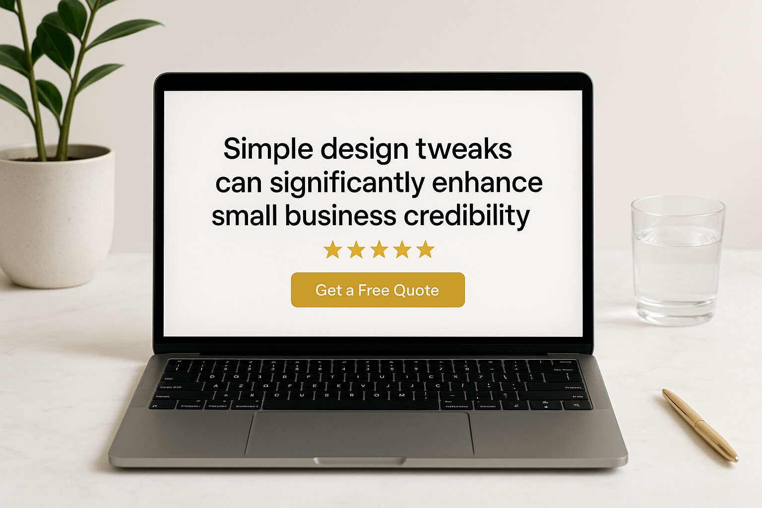
Add a clear Call to Action like “Get a Free Quote” or “Book a Demo.”
Use high quality, on-brand imagery
Avoid generic stock. Choose crisp photos that show your service, your team, and your local context. People trust what they can see.
Credibility Signals That Convert
These elements reduce doubt and increase action. They are small, but powerful.
1. Social proof where eyes land first
Place reviews, logos of clients, or before-and-after photos near the top of your homepage and core service pages.
Add a short, specific quote with a name and city
Show star ratings and link to the full reviews page
For a service business, include a photo of the customer if allowed
2. Clear contact and business details
Legitimate businesses are easy to reach.
Click-to-call phone number in the header
Hours of operation and service area on the contact page and footer
A real street address or service region to reinforce local trust
3. Trust badges and policies
Display SSL, payment icons, warranties, and concise privacy and refund policies. These are tiny confidence boosters that remove last-minute friction.
4. Fast, mobile-first performance
Speed is a trust factor. Industry studies show users bounce quickly when pages lag.
Optimize images with modern formats
Use a lightweight theme and minimize plugins
Test on real phones and keep buttons big and tappable
Content Tweaks That Elevate Professionalism
Good design attracts. Good content convinces.
Write like a guide, not a brochure
Lead with outcomes, not your origin story
Use plain language with short sentences and short paragraphs
End each section with a next step like “See pricing” or “Schedule a call”
Structure every page for clarity
Follow a simple page skeleton:
Headline with a clear benefit
Subhead that sets expectations
Proof such as reviews, stats, or photos
Offer with what is included
FAQ to handle objections
CTA to move forward
Use consistent CTAs
Rotate no more than two CTAs across the site. Examples include Get a Free Consultation and See Packages. Consistency builds memory and action.

Want a Free Website Audit?
Fill out your information below and we will send you a personal screen share video of tips on how to make your actual website better!
Formatting Moves That Make You Look Bigger Than You Are
These are easy wins you can implement in a day.
Smart spacing and alignment
Align text left, keep line length around 55 to 75 characters, and use 16 to 18 px for body copy so it reads comfortably on phones and desktops.
Bullet lists for quick scanning
Visitors skim. Use bullets to highlight benefits, timelines, and inclusions. Bold the first three to five words to improve scannability, like this:
Fast quotes delivered same day
Transparent pricing with no surprise fees
Local expertise that understands your market
Visual hierarchy with headings
Use H2 and H3 subheadings that clearly label each section. This helps readers and search engines understand your page.
Real-World Examples
Roofer in a mid-size city
Add project photos with location tags like “New asphalt roof, Spring Hill FL”
Put a financing badge and warranty statement beside the quote form
Include a 3-step process graphic so homeowners know what happens next
Coffee shop with catering
Feature a menu preview and catering order button above the fold
Show Instagram images with consistent lighting and colors
List delivery partners and availability hours clearly
Realtor scenario that still teaches every local service
Even if you are not a realtor, you can borrow this structure. A realtor’s site often wins trust by placing the agent photo, local reviews, service area map, and a free valuation tool near the top. Translate that idea to your business by showing a founder photo, local testimonials, service area map, and a free quote tool all on the homepage.
Forms That Feel Safe and Easy
A professional website removes friction at the exact moment someone is ready to act.
Keep forms to 5 fields or fewer
Label fields clearly with helper text
Add micro-copy like “We respond within 1 business day” under the submit button
Offer phone and email options for people who dislike forms
Accessibility That Also Improves Conversions
Accessible sites are easier for everyone and signal care and professionalism.
Ensure color contrast meets WCAG standards
Add alt text that describes images meaningfully
Make focus states visible for keyboard navigation
Provide error messages that explain how to fix the issue
Small Design Upgrades With Big Perceived Value
Sticky header with phone and CTA
Service icons that match your brand style
FAQ accordions to reduce page clutter
Before and after sliders for visual services
Clean footer with sitemap, contact, and legal links
Internal Resources To Go Deeper
If you want step-by-step guidance, explore these companion reads on our blog:
These posts expand on design systems, page structure, common pitfalls, and conversion frameworks tailored for small businesses.
Quick Checklist You Can Use Today
Replace your hero with a benefit-driven headline and a single primary CTA
Add three recent reviews with names and cities
Clean up your navigation to five items or fewer
Resize and compress images for faster load times
Standardize fonts, colors, and button styles across pages
Add privacy, terms, and refund links in the footer
Test your forms on a phone and fix any friction
Conclusion and Next Step
Professionalism online is about clarity, trust, and ease. By following these simple design tweaks, you will instantly improve how visitors perceive your brand and how confidently they take the next step. If you are ready to translate how to make small business website look professional into a clean, credible site that wins clients, book a free consultation with Digital Dream Homes and we will map the upgrades for you.
Matt Pieczarka
Other Posts About Small Business Websites You Might Like…
- Small Business Website Design Tips for Small Business Owners
- How to Create a Professional Website for Your Small Business
- Common Small Business Website Mistakes That Are Costing You Customers
- Best Homepage Layout for Small Businesses
- Website Conversion Tips for Small Business: How to Make Your Website Convert Visitors into Clients
- How to Make Small Business Website Look Professional: Simple Design Tweaks That Boost Small Business Credibility
- Best Website Colors For Small Business Branding: How to Choose the Right Colors for Your Brand
- Why Small Business Websites Fail: Why Your Website Isn’t Bringing in Leads
- Mobile Friendly Website Tips For Small Business: Mobile Optimization Tips for Local Business Websites
- Contact Page Optimization for Small Business: How to Create a “Contact Us” Page That Actually Gets Results
The Complete Guide to Keyword Research for Personal Trainers Who Hate SEO
You don't need to be a tech expert to find keywords clients are searching for. This plain-English keyword research guide is written specifically for busy personal trainers.
How to Rank #1 on Google Maps as a Personal Trainer in 5 Concrete Steps
Clients searching 'personal trainer near me' click the top 3 Google Maps results 80% of the time. Here's exactly how to claim your spot with 5 proven local SEO steps.
7 Reasons Google Can’t Find Your Personal Training Business (And How to Fix All of Them)
Google is sending clients to your competitors because of these fixable mistakes. Discover the 7 local SEO errors killing your visibility and the step-by-step fixes.
9 Functional Medicine Instagram Marketing Wins for Growth
9 Functional Medicine Instagram Marketing Wins for Growth Watch the video to learn how we grow our clients' social media profiles to turn followers and posts into leads and
5 Signs You Need a Functional Doctor Social Media Manager
5 Signs You Need a Functional Doctor Social Media Manager Watch the video to learn how we grow our clients' social media profiles to turn followers and posts into leads and
5 Integrative Medicine Social Media Marketing Picks
5 Integrative Medicine Social Media Marketing Picks Watch the video to learn how we grow our clients' social media profiles to turn followers and posts into leads and client
5 Holistic Doctor Social Media Services That Win Trust
5 Holistic Doctor Social Media Services That Win Trust Watch the video to learn how we grow our clients' social media profiles to turn followers and posts into leads and cli
5 Ways a Functional Medicine Social Media Agency Gets Patients
5 Ways a Functional Medicine Social Media Agency Gets Patients Watch the video to learn how we grow our clients' social media profiles to turn followers and posts into leads
9 Functional Medicine Social Media Marketing Wins
9 Functional Medicine Social Media Marketing Wins Watch the video to learn how we grow our clients' social media profiles to turn followers and posts into leads and clients!


