6 White Space Tricks That Make Realtor Websites Feel Ultra-Luxury
Check out the quick video at a real estate website with a lot of empty space that makes it feel luxury
Want More Clients Fast?
Steal This Website Rescue Kit to Get More Clients, More Calls, and More Sales on Autopilot
One of the simplest yet most powerful ways to create a luxury feel in realtor websites is through the use of white space. White space (also known as negative space) is the intentional empty area between design elements, text, and images. It gives your site room to breathe, creates focus, and immediately communicates sophistication.
Let’s explore how you can harness white space to transform your realtor website from cluttered to high-end.
Why White Space Matters in Realtor Websites
Think of white space as the pause in a great speech. Without it, the words blur together. With it, the message resonates.
Luxury brands like Rolex, Tesla, and Apple all lean on generous white space to convey exclusivity. Your website is no different. For realtors, this means when a seller lands on your site, they should instantly feel trust and professionalism…two qualities directly tied to your perceived value.
Studies show that websites with well-structured layouts and strategic white space see up to 20% higher user attention and engagement. That’s because visitors don’t feel overwhelmed. Instead, their eyes are drawn to what matters most: your listings, your call-to-action, and your personal brand.
Create a Luxury Feel in Realtor Websites with Balanced Layouts
The first way to create a luxury feel in realtor websites is by designing balanced layouts.
Imagine two realtor sites:
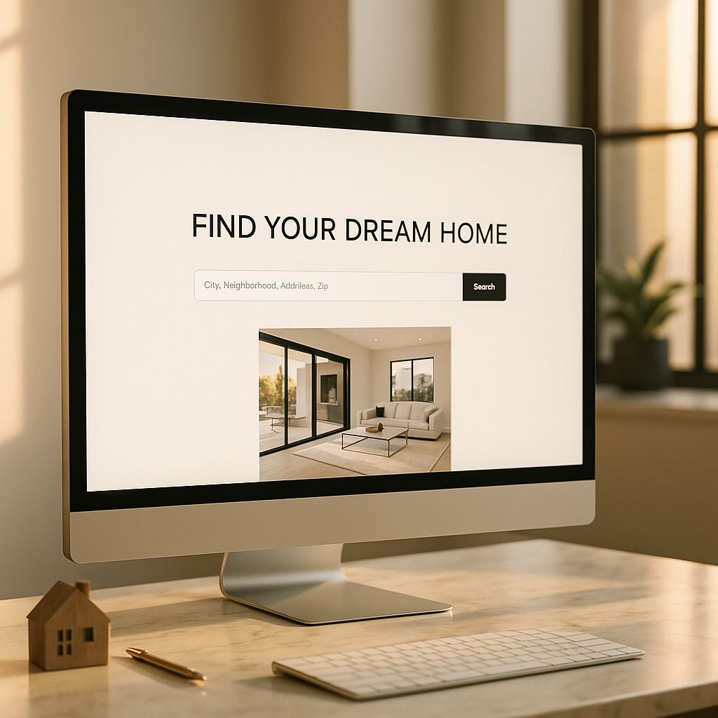
Site A crams five property widgets, six menu tabs, and three calls-to-action into the homepage above the fold.
Site B features a clean headline, a bold IDX property search bar, and plenty of open space surrounding them.
Which one feels more expensive? Site B, every time.
Balanced layouts emphasize clarity. Keep the most important elements front and center, then let white space surround them. This design trick elevates even the simplest property search into something that feels exclusive.
For a practical example of layout strategy, see our post on Best Free Tools for Realtors, where we break down how to use simple design features effectively.
White Space and Typography
Text-heavy realtor websites often scare visitors away. The secret to making long content feel inviting is combining white space with smart typography.
Tips to consider:
Use larger font sizes for headers and keep plenty of space around them.
Stick to one or two fonts. Luxury brands avoid cluttered typography.
Add line spacing so paragraphs feel airy, not cramped.
A well-designed testimonial section, for example, should highlight one client story at a time with generous spacing, not a wall of text. This makes each review feel more credible.
If you want to see how typography pairs with design psychology, check out our post on Color in Realtor Websites: What Converts Best.
Visuals and White Space
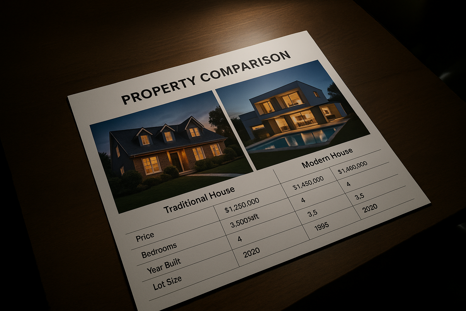
Photos are critical for realtor websites, but crowding too many together diminishes their impact. A single striking photo of a luxury home, surrounded by white space, does more for your brand than a cluttered gallery of ten.
Consider your homepage hero section. A full-screen image of a high-value listing paired with a minimal headline and plenty of negative space sets the tone of exclusivity.
This isn’t just about looks. According to Adobe research, 38% of users stop engaging with a website if the content or layout is unattractive. White space makes your visuals pop and keeps prospects scrolling.
Using White Space to Guide Attention
White space isn’t just about aesthetics…it’s a tool to control focus.
On a property details page, for example, surrounding the “Schedule a Showing” button with white space makes it stand out without adding flashy colors. It’s the digital equivalent of shining a spotlight on the next step.
Here’s a simple flow you can use:
Bold headline
Ample white space
Compelling image
Clear call-to-action
This pattern leads users smoothly through the page while keeping it elegant.
For more ideas on crafting smooth lead journeys, check out our guide on Real Estate Landing Page Optimization.
White Space and Mobile Experience
Over 60% of real estate searches now happen on mobile devices. On a small screen, clutter multiplies.
That’s why white space becomes even more important on mobile layouts. Buttons should be easy to tap with space around them, text should be legible without pinching to zoom, and images should load cleanly without crowding.
Sites that neglect mobile-friendly spacing risk losing half their leads before they ever see a listing.
The Psychology Behind White Space
Luxury is often associated with simplicity and exclusivity. White space tells visitors, “We don’t need to cram this page with noise because what we’re offering speaks for itself.”
Consider how this plays out in real estate:
A cluttered website feels like a bargain bin.
A spacious, minimalist site feels like walking into a high-end showroom.
When sellers and buyers perceive you as high-end, they’re more willing to trust you with their biggest financial decisions.
Common White Space Mistakes to Avoid
While white space is powerful, it can be misused. Here are pitfalls to watch for:
Too much empty space: If important info gets buried, the site feels unfinished.
Inconsistent spacing: Uneven gaps between elements look sloppy instead of intentional.
Ignoring contrast: White space paired with weak typography or dull visuals just looks bland.
The key is balance. Every empty area should feel purposeful.
Data: White Space and Conversion Rates
Here’s a quick chart that illustrates the impact of white space on user behavior, based on industry design studies:
| Website Style | Bounce Rate | Avg. Time on Page | Conversion Rate |
|---|---|---|---|
| Cluttered Layout | 65% | 30 seconds | 1.5% |
| Moderate White Space | 45% | 1 min 10 sec | 2.7% |
| Luxury White Space Design | 30% | 2 min 5 sec | 4.1% |
Notice how the conversion rate nearly triples with well-designed spacing. This is why white space isn’t “empty”…it’s a powerful sales tool.
How White Space Supports Marketing
White space also supports your larger marketing strategy. A clean, luxurious website enhances your Google Ads and SEO campaigns by keeping visitors engaged once they land.
If you’re running paid ads, you want every click to convert. Pairing campaigns with a cluttered site wastes money. To dig deeper into the ad side of things, see our comparison on Facebook Ads vs Google Ads for Realtors.
And for keeping leads organized once they come in, our breakdown of the Top 5 Best CRMs for Realtors shows how to pair great design with smart systems.
Final Thoughts
Learning how to use white space is one of the most effective ways to create a luxury feel in realtor websites. It elevates your brand, guides client attention, and boosts conversions. White space isn’t wasted space…it’s a sign of confidence and professionalism.
At Digital Dream Homes, we specialize in designing realtor websites that blend luxury aesthetics with powerful lead capture. If you’re ready to create a luxury feel in realtor websites that sets you apart from the competition, book a free consultation with us today.
Matt Pieczarka
Want a Free Website Audit?
Fill out your information below and we will send you a personal screen share video of tips on how to make your actual website better!
See How Many Closings You're Losing to Zillow!
Click Here to Use our Calculator to See How Many Clients Zillow is Taking From You Per Year!
Other Posts About Small Business Websites You Might Like…
- Small Business Website Design Tips for Small Business Owners
- How to Create a Professional Website for Your Small Business
- Common Small Business Website Mistakes That Are Costing You Customers
- Best Homepage Layout for Small Businesses
- Website Conversion Tips for Small Business: How to Make Your Website Convert Visitors into Clients
- How to Make Small Business Website Look Professional: Simple Design Tweaks That Boost Small Business Credibility
- Best Website Colors For Small Business Branding: How to Choose the Right Colors for Your Brand
- Why Small Business Websites Fail: Why Your Website Isn’t Bringing in Leads
- Mobile Friendly Website Tips For Small Business: Mobile Optimization Tips for Local Business Websites
- Contact Page Optimization for Small Business: How to Create a “Contact Us” Page That Actually Gets Results
9 Functional Medicine Local SEO Wins That Fill Your Calendar
9 Functional Medicine Local SEO Wins That Fill Your Calendar Watch the video to learn the best SEO technique to get the most traffic to your website! Want More Clients Fast?
7 Functional Medicine SEO Company Checks That Bring More Patients
7 Functional Medicine SEO Company Checks That Bring More Patients Watch the video to learn how to use your website to get qualified leads and more patients! Works for every
7 Functional Medicine SEO Services That Bring More Patients
7 Functional Medicine SEO Services That Bring More Patients Watch the video to learn how to structure your website for the maximum conversions. Works for every industry! Wan
5 Functional Medicine Website Consulting Tweaks That Get More Patients
5 Functional Medicine Website Consulting Tweaks That Get More Patients Watch the video to learn how to structure your website for the maximum conversions. Works for every industry!
7 Functional Medicine Website Redesign Signs You’re Losing Patients
7 Functional Medicine Website Redesign Signs You’re Losing Patients Watch the video to learn how to structure your website for the maximum conversions. Works for every industry!
7 Functional Medicine Website Support Wins That Grow Your Practice
7 Functional Medicine Website Support Wins That Grow Your Practice Watch the video to learn the exact layout to maximize your lead conversions on your website! Works with any indus
7 Integrative Medicine Website Design Services That Win Patients
7 Integrative Medicine Website Design Services That Win Patients Watch the video to learn how to craft your homepage for maximum trust and boost conversions for more leads and sale
7 Holistic Doctor Website Design Secrets That Book Clients
7 Holistic Doctor Website Design Secrets That Book Clients Watch the video to learn the exact layout to boost leads and sales on your website! https://youtu.be/XaEbNPZxi0U?si=AZP_g
9 Functional Medicine Web Design Agency Benefits for Clinics
9 Functional Medicine Web Design Agency Benefits for Clinics Watch the video to learn how to craft the perfect homepage layout to boost trust and sales! https://youtu.be/XaEbNPZxi0