Color in Realtor Websites: What Converts Best
Color in Realtor Websites: What Converts Best begins with how real people feel, scan, and decide in the first few seconds on your page. Use color wisely and your site feels trustworthy, modern, and easy. Use it poorly and even the strongest offer goes quiet.
Color in Realtor Websites: What Converts Best starts with how the brain reads color
Your visitors are not reading every word. They skim in quick Z or F patterns, latch onto high-contrast elements, and make micro-judgments about trust and quality. Color guides those judgments.
A few fast truths that matter for agents:
Contrast beats saturation for legibility and clicks.
Warm accents attract attention, but too much warmth feels aggressive.
Roughly 1 in 12 men have some form of color vision deficiency, so contrast and redundancy matter.
Color must serve a job: help the eye find the next step.
If you want an easy way to upgrade your toolkit while you test colors and layouts, peek at Best Free Tools for Realtors for handy resources you can use right away.
The psychology in plain English
Think of your palette as a cast of characters, each with a role.
Navy and deep blue suggest stability and competence. Great for luxury, coastal, or executive brands.
Forest or emerald green signals growth, money, and nature. Friendly for suburban or acreage specialists.
Gold or amber whispers premium and celebration. Use it as an accent, not a base.
Charcoal and off-black communicate seriousness and clarity. Perfect for text, headers, and dividers.
White and soft neutrals create breathing room and make listings feel brighter.
Pro tip: the accent color’s job is to attract clicks on CTAs and important UI, not to decorate everything. Treat accents like high-voltage tools.
Accessibility and contrast: your non-negotiables
Clear text wins more inquiries. WCAG guidance recommends a 4.5:1 contrast ratio for normal text and 3:1 for large text. To make this practical, we calculated contrast ratios for popular realtor color pairs and plotted them for you.
Use it as a quick gut-check when selecting your text and background combinations. Anything below the 4.5 line is risky for small text.
Practical tips:
Keep paragraph text near black on white or white on a very dark background.
Avoid light gray text on white unless it is large and non-critical.
Provide hover and focus states for links and buttons that are visibly distinct.
Use icons or underlines plus color for important signals so color-blind visitors get the same cues.
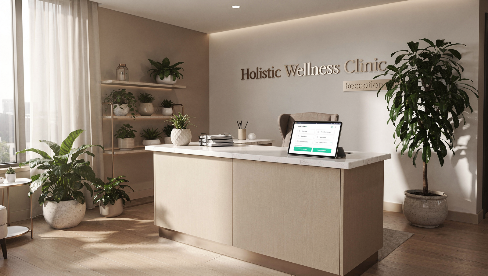
Where color pulls the most weight on a realtor site
Get these zones right first.
Hero section: dark overlay plus white headline to ensure the property photo doesn’t kill legibility. The CTA should be your highest-contrast element on the page.
Primary CTA: one accent color that contrasts strongly with the background. Repeat it consistently for “Book a call,” “Get my valuation,” or “See listings.”
Navigation bar: high contrast for current page and hover states. Keep it simple.
IDX search: inputs and buttons must be obvious. Use neutral fields and a bold search button.
Forms: error states should be more than red text. Add icons and clear borders.
Badges and trust elements: use subtle fills or outlines so they don’t fight the CTA.
Map highlights: choose pins that are visible at a glance and consistent with your accent.
If you are split between ad channels while testing landing page colors, read Facebook Ads vs Google Ads for Realtors to pick the right traffic source for your offer.
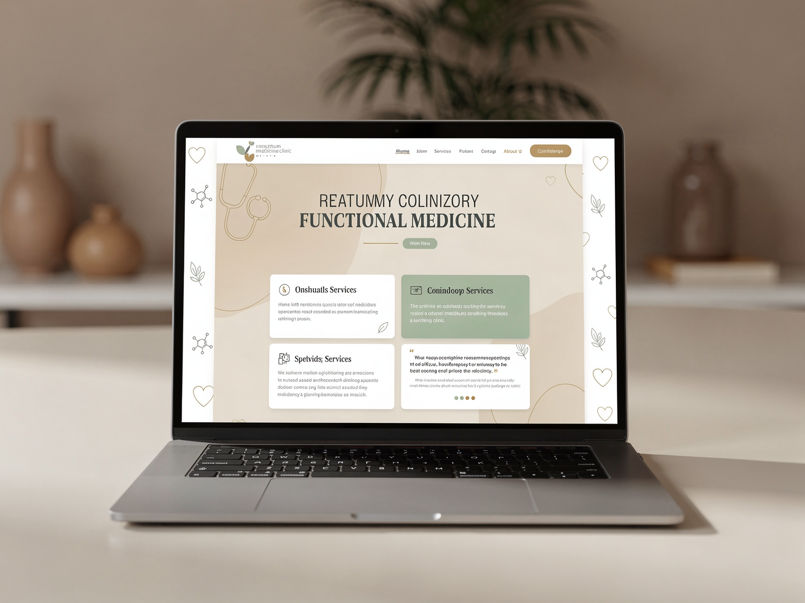
Palette recipes that actually convert
Below are field-tested palettes with hex codes you can copy into your theme or global styles. Tweak values for your brand, keep contrast high, and keep accents consistent.
Luxury listing specialist
Base: Navy
#0B1B3BText: White
#FFFFFFand Charcoal#222222Accent: Gold
#C9A227Use it for: hero headline in white, gold CTA, navy buttons on light sections.
Family-friendly suburban pro
Base: Slate
#334155Text: White
#FFFFFFand Dark Gray#1F2937Accent: Teal
#0F766EUse it for: teal CTA on white background, slate headers, generous white space.
Eco-forward or acreage specialist
Base: Deep Green
#0B3D2EText: White
#FFFFFFAccent: Warm Sand
#D6AD60Use it for: green header bar, sand CTA, white content areas for calm clarity.
Downtown condo specialist
Base: Charcoal
#222222Text: White
#FFFFFFAccent: Electric Blue
#2563EBUse it for: bold blue CTAs, white content cards on charcoal sections, high-contrast nav.
Real-world scenarios from the field
The high-end lister who blended in
Maria specializes in luxury across the Westside. Her site used tasteful beige on beige. It felt elegant, but the CTAs disappeared. We kept the photography, introduced navy as the base, white for headlines, and a restrained gold accent for buttons. Lead forms jumped because the CTA now contrasts strongly with both hero photos and light sections.
The buyer-heavy agent who needed balance
Jeremy worked mostly with first-time buyers. His site was all bright green. We shifted to slate for headers, white backgrounds for readability, and saved green for the “Get pre-approved” and “Save this home” CTAs. The new hierarchy helped buyers find the next step without feeling shouted at.
The team site with too many accents
A four-agent team had three accent colors and a rotating rainbow in the nav. We simplified to one accent, normalized link colors, and gave error states a consistent red plus icon. Bounce rate fell because the eye finally had a clear path.
If you are dialing in your operations while you test design, see Top 5 Best CRMs for Realtors to make sure your color-boosted conversions actually flow into a system that nurtures and closes.
Your five-step color playbook
Define the job of each color
Base for backgrounds, text for legibility, one accent for CTAs, a quiet secondary accent for highlights.Lock in global styles
In your theme builder, set global colors and name them logically. Example:--base,--text,--accent,--muted.Check contrast early
Use the chart above and a contrast checker. Validate body text, nav links, and button text on every background you use.Prototype two variations
Keep layout identical and test only the CTA color and its surrounding background. Small changes keep results clean.Ship, measure, and iterate
Track clicks on CTAs, form completion rate, and time on page. Run each test for enough sessions to be confident.
What to A/B test first
Start with the elements that move money.
Primary CTA color on a white background vs on a dark band.
Header bar light vs dark to see which improves menu use.
Form submit button solid vs outlined style with the same accent.
Card overlays with dark gradient vs no overlay for listing photos.
Error states that combine color plus icon vs color alone.
Measure:
Click-through rate on CTAs
Form completion rate
Scroll depth to the first form
Calls or appointment bookings per 100 visitors
If your landing page is focused on sellers, pair smart color choices with a strong offer. For inspiration on building the funnel behind the colors, you will like Real Estate Website Conversion Tips and How to Build a Seller Funnel.
A quick checklist before you hit publish
Body text passes 4.5:1 on every background.
One accent color owns all primary CTAs.
Headline on hero photos is readable on mobile and desktop.
Nav links are obvious, with focus styles for keyboard navigation.
Error messages are not just red text.
You can change theme colors globally with variables or design tokens.
Bringing it all together
Color is not decoration. It is how your site communicates priority, trust, and flow. Choose a calm base, keep text crystal clear, reserve one accent for decisive actions, and test small changes with real traffic.
When you are ready for hands-on help applying all of this, book a free strategy call and let’s build a site that looks premium and converts like a machine. At Digital Dream Homes we combine research-driven design, IDX-friendly layouts, and clear testing plans to turn visitors into clients. Color in Realtor Websites: What Converts Best is the question we answer in every build.
Matt Pieczarka
Want a Free Website Audit?
Fill out your information below and we will send you a personal screen share video of tips on how to make your actual website better!
See How Many Closings You're Losing to Zillow!
Click Here to Use our Calculator to See How Many Clients Zillow is Taking From You Per Year!
Free Tools For Businesses in 2026 You’ll Wish You Found Sooner
Free Marketing Tools For Small Business 2026 That Print Money Facebook X LinkedIn Threads Email Heads-up for busy entrepreneurs: these tools take minutes to implement but can pay o
Building Customer Trust For Small Business In 7 Simple Steps
Building Customer Trust For Small Business In 7 Simple Steps Facebook X LinkedIn Threads Email Quick heads-up: This simple tweak learned in this post helped one of our clients boos
Customer Testimonials Small Business Branding Secrets That Explode Trust
Customer Testimonials Small Business Branding Secrets That Explode Trust Facebook X LinkedIn Threads Email Bookmark this page now! It’s full of practical strategies you’ll actu
Brand Voice Tips For Small Business That Actually Connect
Brand Voice Tips For Small Business That Actually Connect Facebook X LinkedIn Threads Email Quick heads-up: We tested dozens of strategies so you don’t have to. Here’s what’s
How AI is Transforming Transaction Coordination Services
How AI is Transforming Transaction Coordination Services Facebook X LinkedIn Threads Email In 2025, aside from hot topics in real estate about interest rates and inventory…th
Personal Branding For Small Business Owners Who Want More Clients
Personal Branding For Small Business Owners Who Want More Clients Facebook X LinkedIn Threads Email This post breaks down the same process our clients use to attract better leads a
Authentic Branding For Small Business In 2026
Authentic Branding For Small Business In 2026 Facebook X LinkedIn Threads Email Bookmark this page now! It’s full of practical strategies you’ll actually use this week If you a
How To Flip Bad Reviews Into Customers
Responding To Negative Reviews Small Business Owners Can Turn Into Sales Facebook X LinkedIn Threads Email Heads-up for busy entrepreneurs: these tactics take minutes to implement
Brand Visuals For Small Business That Actually Get Noticed
Brand Visuals For Small Business That Actually Get Noticed Facebook X LinkedIn Threads Email Quick heads-up: This simple tweak learned in this post helped one of our clients boost