Small Website Details in Real Estate That Win Clients

Small website details in real estate that win clients are the quiet conversion engines that separate a pretty site from a profitable one. They are the tiny choices in copy, layout, motion, and interaction that make visitors feel confident enough to click, call, and commit.

Small Website Details in Real Estate That Win Clients: why they matter

Buyers and sellers already know how to browse listings. What they do not know yet is whether you are the right person to guide the process. Small details lower friction, build trust, and create momentum in the first 10 seconds. That is the moment when visitors decide to stay or leave. Your micro choices set the tone for everything that follows.

The five second trust test

Open your homepage and pretend you are a first time visitor. In five seconds, can you answer three questions?

  1. Who is this for

  2. What problem do you solve

  3. What should I do next

If the answers are not obvious, the fix is almost always in the small stuff. Sharper headlines, clearer buttons, less clutter, and tighter spacing can change the outcome without changing your entire design. For ideas on sharpening your first impression, see our post Why Homepage Headlines Matter More Than You Think in Real Estate.

Copy that converts without shouting

Microcopy is the tiny text around forms, buttons, and alerts. It reduces doubt and increases action.

  • Button labels that say what happens next

    • Weak: Learn More

    • Strong: See Raleigh Listings

  • Field hints that answer the silent question

    • Weak: Phone

    • Strong: Mobile number for quick updates

  • Privacy reassurance near forms

    • One line works: We never share your info

Tip for solo agents: mirror the way you speak on calls. If you say schedule a quick chat, write schedule a quick chat. Consistency builds trust.

Buttons that people actually click

Buttons are small, and they do heavy lifting. Use these rules.

  • One primary action above the fold. Everything else is secondary.

  • High contrast color that passes accessibility checks.

  • At least 44 by 44 pixels for easy tapping on mobile.

  • Put verbs first. Start Search, Get Home Value, Book a Call.

  • Add a subtle hover effect so the button feels alive.

If you want a quick toolbox to pick colors, icons, and contrast checkers, grab the resources in Best Free Tools for Realtors.

Navigation that does not make people think

A tiny change in menu order can improve clicks. Lead focused items should come first.

  • Buy, Sell, Home Value, About, Contact

  • Keep dropdowns short. Three to five items is plenty.

  • Add a sticky contact button on mobile that opens a simple form.

Pro tip: make your logo click to Home and keep it consistent across every page. Familiar patterns reduce cognitive load.

Forms that feel effortless

Well designed forms feel short even when they ask for important details.

  • Group related fields. Name and email together, property details together.

  • Use smart defaults and auto complete where possible.

  • Show progress when a form has more than one step. Step 1 of 2 feels manageable.

  • Replace error walls with inline nudges. Try a hint under the exact field that needs attention.

A conversational first step works great for sellers. Ask for a street address with one field, then reveal name and email after they submit. That small detail increases completion rates because the first action feels easy.

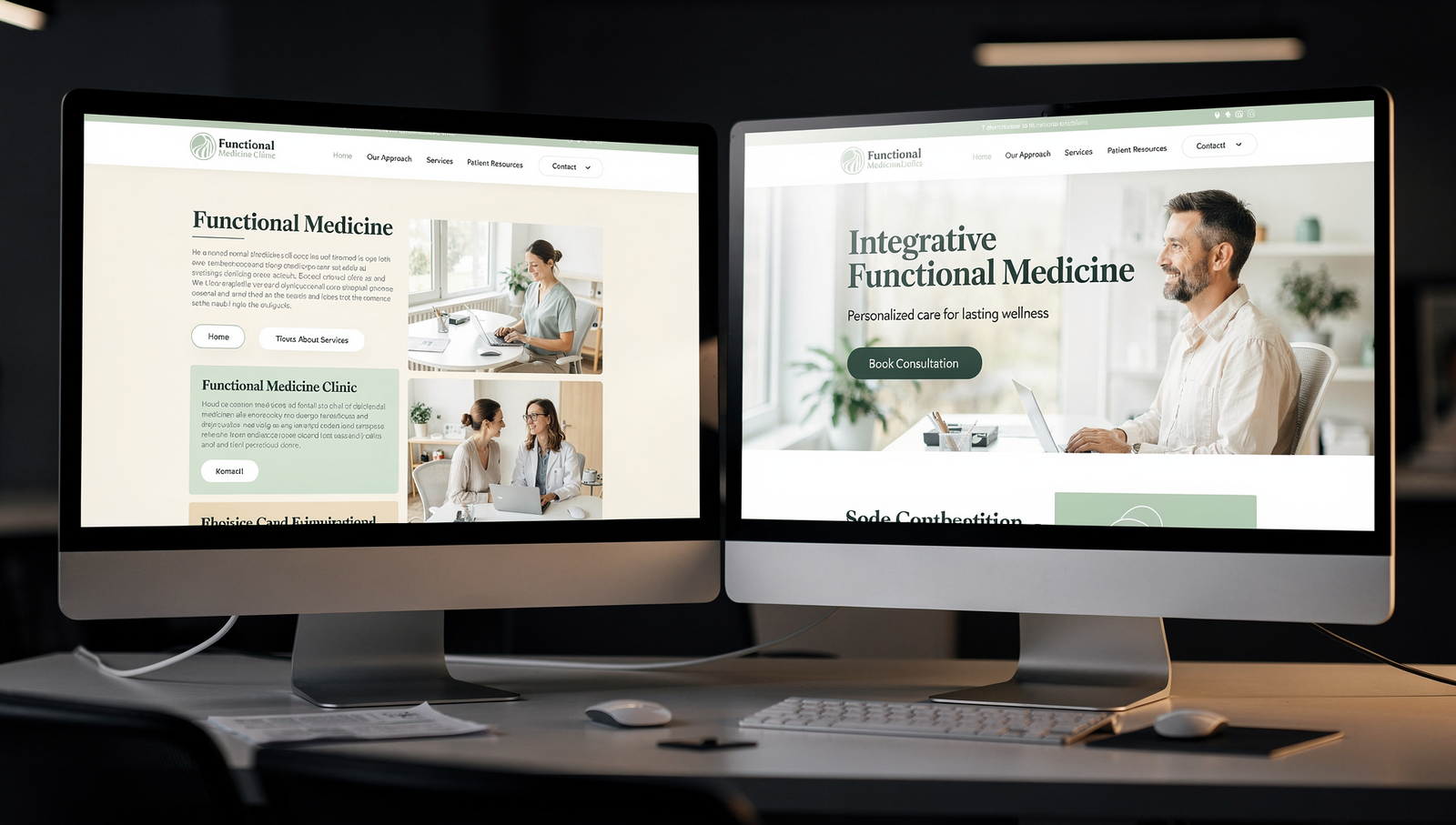
Photos that tell a story fast

Headshots and lifestyle photos do more than decorate. They signal professionalism and relatability.

  • Headshot with clean background, soft light, confident posture

  • One community shot that says you live here and work here

  • A closing day moment with happy clients, used with permission

  • Alt text on every image for accessibility and SEO

Want motion instead of stills on your hero? Our guide real estate video background websites explains when short video loops help and when a clean image is better.

Spacing that feels like luxury

White space is not empty. It is breathing room that lets your value shine. Increase line height a touch, expand padding around key sections, and resist the urge to stack too many modules. For a deep dive, see How to Use White Space to Create a Luxury Feel in Realtor Websites.

Tiny trust cues that make a big difference

Trust builds one small cue at a time.

  • A short testimonial near your main CTA

  • Local badges or designations placed tastefully

  • Service area listed in text, not only on a map

  • Clickable phone number with tap to call on mobile

  • Business hours and response time near your contact form

These cues remove hesitation at the exact moment a visitor considers reaching out.

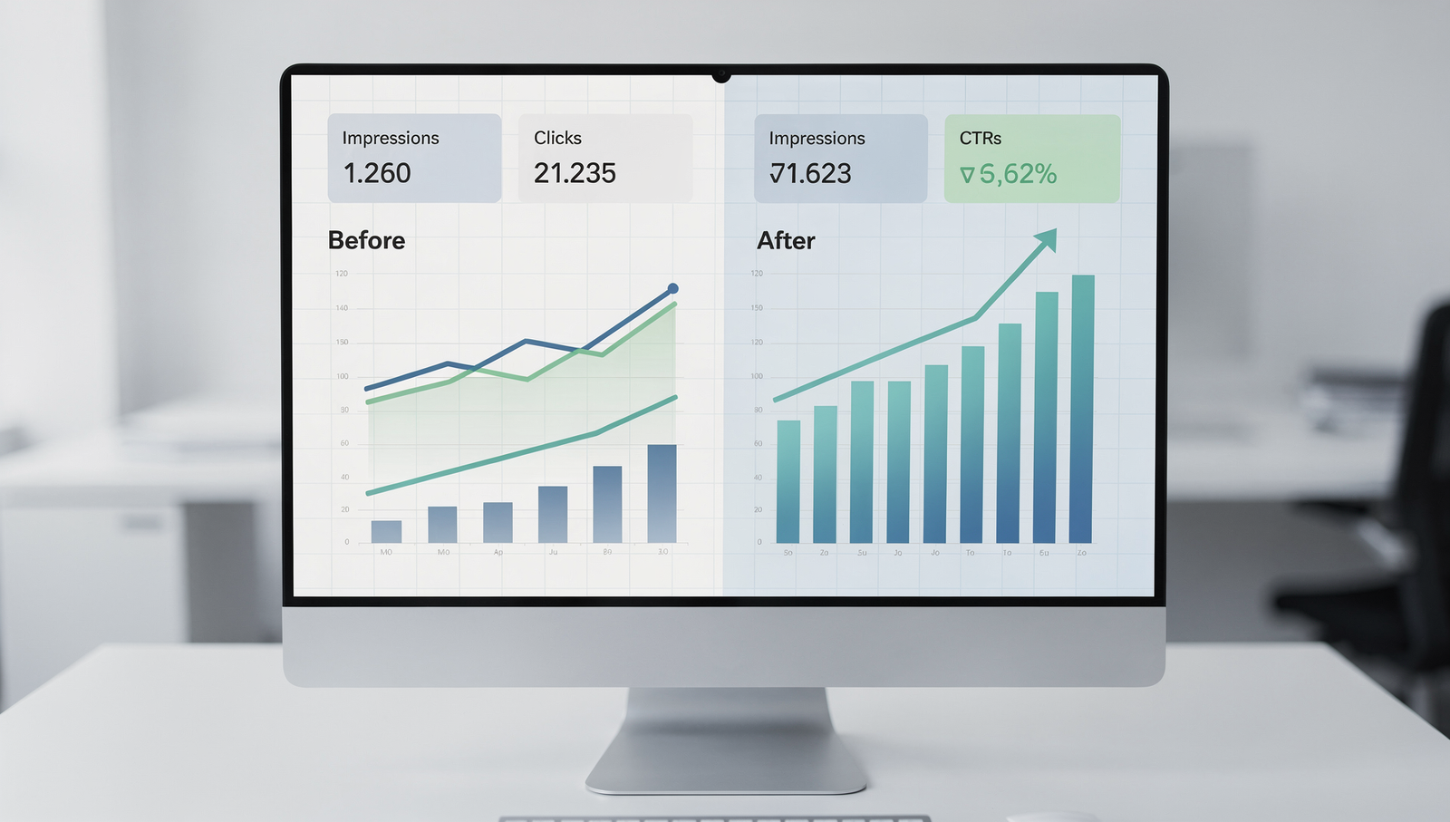
Data snapshot: small details that move the needle

Below is a practical benchmark table drawn from UX and CRO best practices used across service based websites. Treat these as directional ranges, then test on your audience.

Detail changeTypical lift rangeWhy it works
Button label from Learn More to Get Home Value15 to 35 percentClarity plus intent creates confident clicks
Add one privacy line under forms8 to 20 percentReduces perceived risk at the moment of decision
Replace carousel with single hero image10 to 25 percentRemoves distraction and improves message focus
Reorder nav to Buy, Sell, Home Value5 to 15 percentPrioritizes high intent paths
Compress images and lazy load10 to 30 percentFaster pages lower bounce and improve search visibility


Realtor in suit beside holographic display of website details like buttons, forms, and testimonials glowing in golden light.

Accessibility that earns more reach

Accessibility is not only compliance. It is good business. High contrast buttons, readable font sizes, keyboard navigation, and descriptive alt text help everyone. Accessibility also improves your search footprint because search engines can parse your content more clearly.

Quick wins you can implement today

  • Minimum font size 16 on body text

  • Color contrast ratio at least 4.5 to 1 for text

  • Labels tied to form fields for screen readers

  • Focus states visible when tabbing through links

Local signals that help you rank and convert

Small local signals compound into strong local SEO and stronger trust.

  • Put your city and neighborhoods in headlines and body copy where natural

  • Embed a static map image that links to your Google Business Profile

  • Add schema for LocalBusiness with service area

  • Include a short About preview on the homepage that ties you to the community

For a deeper path to the map pack, read How to Rank Higher on Google Maps on the DDH blog.

Performance that feels instant

Speed is a detail your visitors cannot see, yet they feel it immediately.

  • Keep hero images under 250 KB when possible

  • Use modern formats like WebP

  • Defer non critical scripts

  • Cache pages and serve from a reliable host

Faster sites get lower bounce rates and higher engagement. Those are two ingredients that lead to more inquiries.

The friendly checklist you can run this week

  • Rewrite three buttons with specific outcomes

  • Add one privacy reassurance line to each lead form

  • Swap the busy hero for one strong image with a single CTA

  • Reorder your navigation to highlight buyer and seller actions

  • Compress images and add alt text that describes the content

  • Place one testimonial within view of the primary CTA

  • Make your phone number clickable and visible on mobile

  • Add your service area in plain text on the homepage

Complete that list and you will feel the difference in both analytics and inquiries.

Real world scenarios

Solo agent in a suburban market

  • Changed hero headline to Speak to a Local Listing Expert in Cary

  • Replaced rotating carousel with a quiet exterior photo at sunrise

  • Moved Home Value to primary CTA and added a one line privacy note
    Result after four weeks

  • Bounce rate down, form starts up, more seller conversations on the calendar

Boutique team in a luxury market

  • Tightened white space, upgraded headshots, simplified menu

  • Added two authentic testimonials near the main CTA

  • Embedded a short neighborhood video clipped to 12 seconds
    Result after six weeks

  • Longer session time, more consult requests, stronger brand perception on calls

For structure ideas and widget placement, our post Using Elementor for Real Estate Websites walks through practical layouts that support these details.

Content patterns that create momentum

Visitors scan first and read second. Use scannable patterns that still feel human.

  • One idea per paragraph

  • Subheadlines that answer a question

  • Short bullet lists for decisions

  • Plain words instead of jargon

  • Real photos over stock where possible

These patterns help busy buyers and sellers move from curiosity to confidence.

Bringing it together with paid and organic traffic

Small details do not work in a vacuum. Pair them with consistent traffic and disciplined follow up.

  • Use Google Ads to capture active intent for searches like home value city

  • Retarget with simple testimonial creatives that match your site’s look

  • Nurture new leads inside your CRM with time based reminders

If you want a side by side look at ad channels, take a look at Facebook Ads vs Google Ads for Realtors. To manage new leads without chaos, compare tools in Top 5 Best CRMs for Realtors.

Closing thoughts

When you zoom out, success rarely hinges on a single redesign. It comes from small website details in real estate that win clients, repeated across every page, every button, every form, and every visit.

At the end of the day, the goal is not only clicks. The goal is confidence. If you want expert eyes on your site and a prioritized action plan, book a free consultation with Digital Dream Homes. We will review your site, identify the highest leverage fixes, and implement the small website details in real estate that win clients.

Want a Free Website Audit?

Fill out your information below and we will send you a personal screen share video of tips on how to make your actual website better!

See How Many Closings You're Losing to Zillow!

Click Here to Use our Calculator to See How Many Clients Zillow is Taking From You Per Year!

Claim Your Free Guide!

Fill out the form and get our complete Google Business Profile guide—designed to bring in more clients fast!